Normal and Abnormal in Climate Science
by Dr. Ingrid Zabel, PRI’s Climate Change Education Manager
Last updated February 5, 2021
We hear that our climate is changing, but if we talk about magnitudes of temperature change, we have to ask the question “change relative to what?” What baseline should we use when comparing today’s temperatures with the past? And if today’s temperatures are abnormally high, what is a normal temperature anyway?
As we go about our lives, we tend to think of “normal” as what we are used to. As adults, we might remember how cold the winters were when we were kids, or how we used to play in huge snowdrifts.

Original caption: “The Great blizzard of 1978. Taken on Maple Street in Woonsocket, Rhode Island. This was about a week after the storm, when people could finally come out of their homes.” Photograph by “Dahoov2” (Wikimedia Commons; public domain).
But were those snowdrifts really so huge, or was it just that we were small? And for those of us who are middle-aged and older, can we really remember the weather conditions from decades ago?
Research has shown that our perceptions of “normal” weather are based on what the weather was like two to eight years ago. [1] Our memories and perceptions can be skewed and they keep shifting, which is why it’s so important to have something more reliable: data. With the availability of climate data over many decades, scientists have defined a climate normal as an arithmetic average of a climate variable such as temperature or precipitation over a 30-year period. The map below of the northeastern U.S. shows computed normal maximum temperatures for the month of February, where the climate normal is the period from 1971 to 2000. We could use this data set as a baseline for comparing today’s temperatures, to see how much they have changed since the late 20th century.

Map of the northeastern United States showing normal maximum temperatures for the month of February based on a climate normal period of 1971 to 2000. Image source: Northeast Regional Climate Center, Cornell University. Link
Climate normals themselves are now changing, and the map above would look different if we had chosen a different 30-year period. The graph below shows how climate normals for global surface temperature—including both the Earth’s land and ocean—have shifted relative to a baseline of 1951-1980. The most recent climate normal, computed for the time period of 1991-2020, has increased by almost 0.6 °C (1.1 °F).

Data: National Centers for Environmental Information, Climate at a Glance. Link
That rate corresponds to a temperature increase of about 2 °F in a typical American’s lifespan. That’s a lot! Think about how you feel when you have a fever that is 2 °F above your normal temperature. It is important to note that if the Earth’s temperature increases by 2 °F, that does not mean that human body temperatures will rise by that amount. The human metabolism can adjust to changes in temperature (except at extremes), but many natural systems, including animal and plant life, can be sensitive to small changes in temperature.
Climate normals are used as baselines for quantities that are commonly used in climate science called temperature anomalies. This might seem like a strange name, because we’re used to the word “anomaly” meaning something like “oddity,” “abnormality,” or “quirk.” What is a temperature anomaly?
Sometimes words are used differently in science than in everyday language. In climate science, a temperature anomaly is simply a difference in temperature relative to some average—or baseline—temperature. A positive temperature anomaly indicates a temperature warmer than the baseline, and a negative temperature anomaly indicates a temperature colder than the baseline. The baseline is a long-term average of temperatures, often over thirty years. Sound familiar? The baseline is our climate normal!

Diagram illustrating temperature anomalies relative to a baseline. Image by Ingrid Zabel, Paleontological Research Institution.
An analogy for anomalies (that’s a tongue twister!) might be shown in a graph of your daily commute time to work. Let’s say your baseline average commute time over several years is twenty minutes, whether by bus or by car. On some days your commute will be longer, maybe because you encountered a lot of red lights or you were behind a school bus. On other days your commute will be shorter than the baseline, for example, if traffic is light.

Diagram illustrating commute time anomalies relative to a baseline. Image by Ingrid Zabel, Paleontological Research Institution.
Below is a graph of annual temperature anomalies for Binghamton, NY from 1952 to 2019. The baseline here is not a 30-year climate normal, but instead is temperature averaged over a longer period (1952-2000, approximately the second half of the 20th century.) Baselines for temperature anomalies don’t always have to be thirty years long—that’s just a minimum. On the graph we see that some years are colder than the baseline and some are warmer. We also see a warming trend, because the anomalies in the first half of the graph tend to be negative and the anomalies in the second half of the graph tend to be positive.
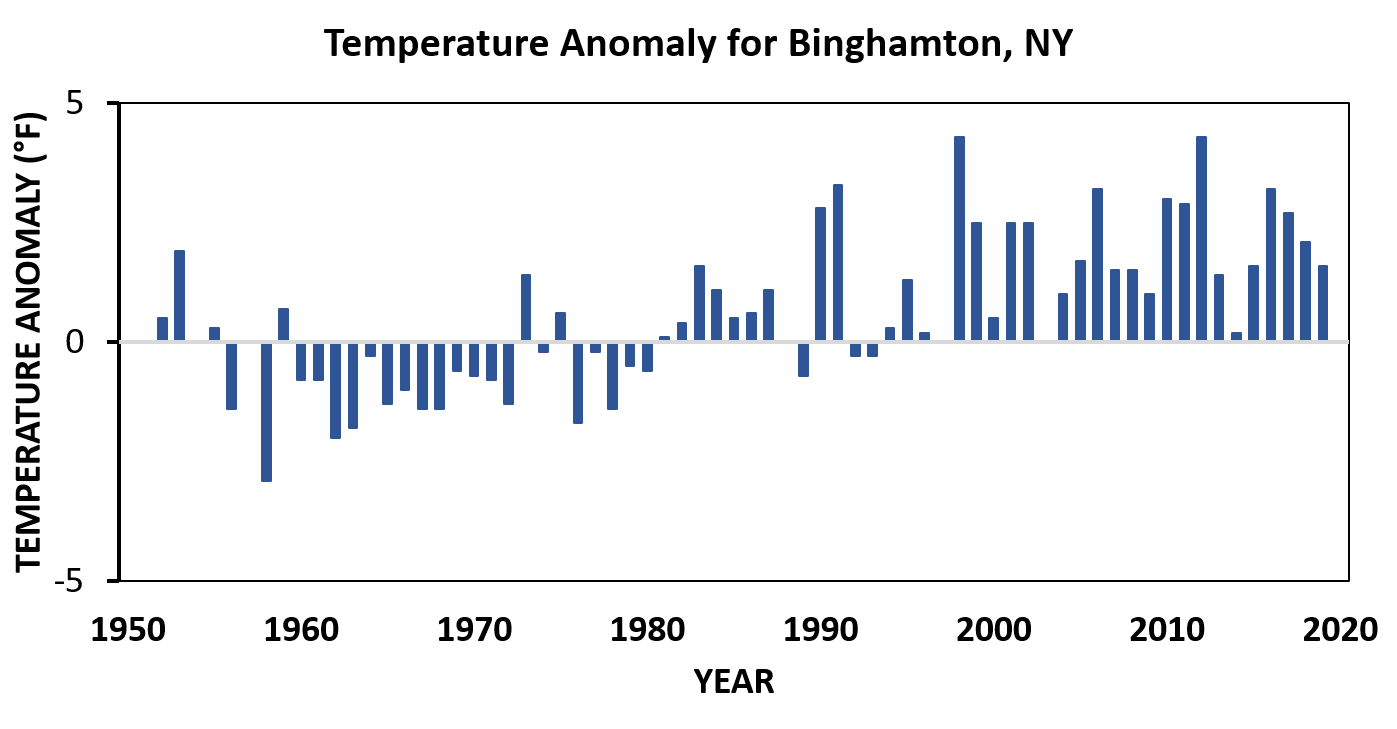
Graph showing annual temperature anomalies for Binghamton, NY during the period of 1951-2019. Data source: National Centers for Environmental Information, Climate at a Glance (Link). Image by Ingrid Zabel, Paleontological Research Institution.
Why do we use temperature anomalies instead of absolute temperature? For one thing, temperature anomalies allow us to better understand changes over time. They can also reduce the effects of different locations, which makes averaging trends over multiple locations more meaningful. For example, the temperature anomalies shown here for Phoenix, AZ and Binghamton, NY are pretty similar in magnitude, while the absolute temperatures are very different in those two places.


Comparison of temperature anomolies in Phoenix, AZ and Binghamton, NY over the period of 1950-2019. Data source: National Centers for Environmental Information, Climate at a Glance. Link. Image by Ingrid Zabel, Paleontological Research Institution.

Comparison of average temperatures in Phoenix, AZ and Binghamton, NY over the period of 1950-2019. Data source: National Centers for Environmental Information, Climate at a Glance. Link. Image by Ingrid Zabel, Paleontological Research Institution.
If you were interested in a global temperature anomaly, you could average temperature anomalies from different locations all over the world. In the past, these measurements might have come from weather stations on land and instruments on ocean buoys. Today, we have the advantage of also having instruments on satellites, giving broad, continuous coverage across the globe as shown in this map.

Map showing global temperature anomalies in December 2020 relative to the 1951-1980 climate normal. Image from NASA. Link
Anomalies and normals might seem like confusing terminology, but they’re meant to give us meaningful ways to understand climate change. And wanting to understand something better is normal!
If you want to learn more about climate and climate change, please visit the Digital Encyclopedia of Earth Science on PRI’s Earth@Home website.
Reference
[1] Moore, Frances C., Nick Obradovich, Flavio Lehner, and Patrick Baylis. “Rapidly Declining Remarkability of Temperature Anomalies May Obscure Public Perception of Climate Change.” Proceedings of the National Academy of Sciences 116, no. 11 (March 12, 2019): 4905–10. Link